
The homepage is the one page almost everybody sees and almost nobody reads. People land, scroll, and decide whether to stay. Designing it well does not mean making it beautiful: it means letting someone who has just arrived find an answer quickly.
This guide is for people who run a business and have a site to rebuild or tidy up, not for people who design sites for a living.
The three questions it has to answer
Anyone landing on your homepage has three questions in mind, and if they find no answer they leave.
What do you do? Not the positioning, not the mission: the trade, in words a customer would use. "Integrated solutions for digital transformation" is not an answer. "Boiler repairs in Bergamo" is.
Is this for me? A printer that works for companies and one that prints dissertations do the same job and speak to two different people. Whoever is reading has to recognise themselves.
What do I do now? There has to be one obvious action, and only one main one: request a quote, book, buy, call. If there are six, there are none.
If your homepage answers those three up top, above the first scroll, the rest is finishing work.
The parts that come up every time
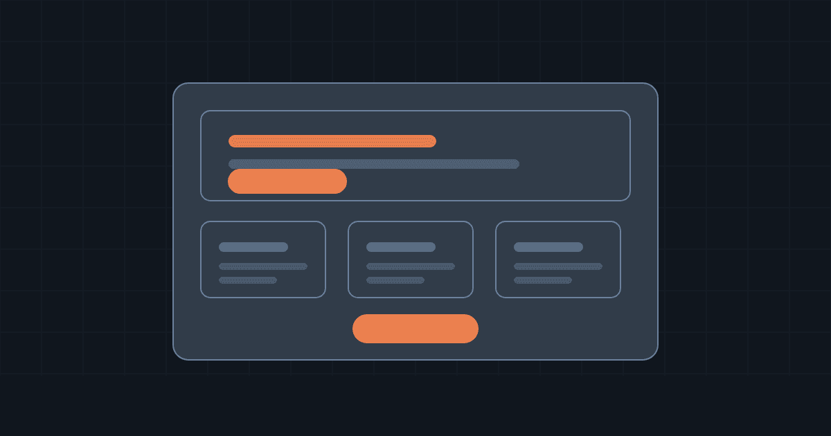
The opening. A headline that states the trade, a line that sharpens it, a button. It is the most valuable space on the site: do not waste it on a slogan that could sit on anybody else's.
The proof. Something showing you genuinely exist and that somebody has already trusted you: clients, real numbers, a certification, reviews. Without proof the rest reads as a promise.
The offer. Three or four blocks covering what you sell, each leading to its own page. The homepage does not have to explain everything: it has to direct traffic.
The objections. What it costs, how long it takes, what happens afterwards. The questions you get on the phone are the ones to answer here first.
The close. At the bottom, whoever got that far is the most interested person on the page. Repeat the main action.
Contacts, in plain sight. Phone, email, address. A company number and a physical address say more about being serious than a thousand words claiming it.
The mistakes that cost you
- The carousel that rotates on its own. It takes the most important spot on the page and changes the message before it gets read. If you have three things to say, pick one.
- The interchangeable slogan. If you cover the logo and the sentence could belong to a competitor, that sentence is not working.
- The wall of text. People scroll, they do not read. Headings that make sense on their own, short paragraphs, lists.
- The button nobody finds. One main action, repeated top and bottom, always in the same words.
- Enormous images. A 4 MB photo does not look better: it looks later. And people waiting often close the tab.
- The site built for the phone last. Most visits come from there. Look at your homepage on your own phone before you look at it on your monitor.
Four setups, depending on what you do
| Type of business | The opening leads with | Main action | What cannot be missing |
|---|---|---|---|
| Professional services | The problem you solve | Request a quote | Who you are, references, timescales |
| Online shop | Products and categories | Buy / Browse | Shipping, returns, payments |
| Local business | What you do and where | Call / Book | Map, opening hours, big phone number |
| Software or subscription service | What the product does, in one line | Try it | Clear prices, what is included |
The real difference is not graphic. It is which piece of information matters most to the person arriving: a garage's customer cares where you are and whether you answer the phone, a management software customer cares what it costs and whether it works with what they already use.
Speed is part of the design
A carefully made homepage that opens in three seconds works worse than an ordinary homepage that opens in half a second. Patience runs short for people arriving from a search, and the wait is the first thing they experience of your work.
Three things weigh more than the rest, in order of payoff:
- The images. Export them at the size they are actually displayed, in a modern format, and let the ones further down load only when they are needed.
- What you load from elsewhere. Every widget, map, chat box and external font is one more connection to a server you do not control.
- Where the site lives. A slow server puts a delay underneath everything else, and no amount of optimisation gets it back.
Checklist before publishing
- Can someone tell what you do without scrolling?
- Can they tell who it is for?
- Is there one main action, and is it obvious?
- Would the headline work only for you, or for a competitor too?
- Is there proof that somebody has already trusted you?
- Do the three questions you get on the phone have answers?
- Can the phone number and email be found without hunting?
- Have you looked at it on a phone, held upright, with your own eyes?
- Do the images weigh what they should?
- How long does it take to open on mobile data?
- Is there a reason to come back, or has it looked the same for a year?
- Has someone outside your business tried it without you explaining anything?
The last one is the most useful of the twelve. Give the address to somebody with no connection to your work, stay quiet, and watch them for a minute. What they fail to find is your to-do list.

